
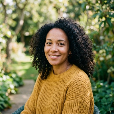

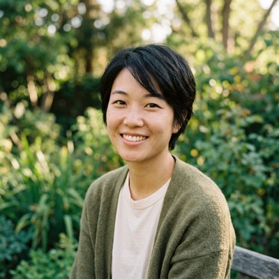
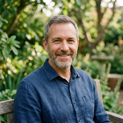






We loved having you, and we'll be running the next one at the end of the month, with a longer sound bath.

Design guide
The visual language of dandelion.events as it exists in code today. This page is rendered with the site's own app.css and bootstrap5.css, so swatches, type and components are the real thing. The site is Bootstrap 5.3.8, restyled through its variables.
The root font size is 17px (19px from 1680px, 21px from 1920px) at the browser's default text size, set as a percentage so it follows the reader's own setting, and rem values scale with it and the viewport. Sizes are in rem (or em, to follow the text); px is kept for 1–2px hairlines, shadows and the focus ring, for breakpoints and the container max-widths that fit inside them, and for overrides that must line up with Google Maps. Avatars take a size class (.avatar-xs to .avatar-2xl), not a width. Colour values, radii, type sizes and the spacing scale are measured live; other sizes are copied from the stylesheets.
Colour
Every family is a ramp of steps generated from its 500 with oklch(), so steps at the same lightness look equally light whatever the hue. Tints (50–200) sit at fixed lightness; shades (400–800) are relative to the 500, with 800 capped dark enough for text on tints. The 400 is .06 lighter than the 500, or half way to the 200 when the 500 is too light for that (yellow), and the 300 is halfway between the 200 and 400, so the steps stay in order however light the colour.
Components use the 500 for fills, 600 for hover, 100 for alert, toast and badge backgrounds, and 800 for text on those tints. Red text (text-danger, form errors) takes red's 600, as the 500 is under 4.5:1 on white.
Each 500 is as vivid as sRGB allows at its lightness: green, orange and yellow sit at the edge, and red and lavender, which have more room, stop at four-fifths of theirs, so they sit level with the green rather than glare.
Lightness follows the hue, as each colour reads as itself only in a band: yellow only when light, red only when fairly dark. Hues stay clear of their neighbours: red short of both orange-red and pink, orange an amber at 72, set apart from yellow at 90 by lightness as well (their tints, which share a lightness, aren't, so warning badges take the 200), and lavender the default green turned to 300. Yellow's 500 is the lightest, so its 200 to 500 sit close together, set apart more by saturation than lightness.
Green
The theme colour: green by default. Organisations and events set--theme-500 only (through /theme.css). Every theme colour is a solid step of this ramp; the only translucent ones are the focus ring, .badge-overlay (the 500 at 70%, over images) and chart projections (the 500 at 50%, and in the contributions chart a 30% fill with a 50% border), so they read as estimates.rgba(var(--bs-*-rgb)) colours need an rgb triplet, so /theme.css also sets --theme-500-rgb.Lavender
The default site's AI well and.lavender-wash backgrounds. Its steps come from --color-lavender-500.Yellow
For highlighted or rewarded things, throughtext-bg-yellow: Featured, Co-host, rota points, PATCH routes. Its steps come from --color-yellow-500.Orange
Warning: each warning class (alert-warning, toast-warning, table-warning, btn-warning, text-bg-warning) sets the steps it uses as--variant-*, and each component maps those to its roles once. The 500 is also Bootstrap's $warning in bootstrap5.scss. table-warning rows mix 30% of the way from the 50 to the 200 for hover, stripes and active rows.Red
Danger, through the danger classes (alert-danger, toast-danger, table-danger, btn-danger, text-bg-danger), which map its steps to their roles as orange's warning classes do. The 500 is also Bootstrap's$danger in bootstrap5.scss, and its 600 is $form-feedback-invalid-color, so form errors and text-danger (red text) are the 600. Danger badges take the 200, as red's 100 reads pink, as do warning badges (see Orange). table-danger rows mix 30% of the way from the 50 to the 200 for hover, stripes and active rows.Greys, black and white
Bootstrap's own variables, set in bootstrap5.scss to near-neutral greys: Bootstrap's lightness steps with a trace of warmth (designed at oklch hue 75, chroma .00225–.003, then rounded to hex). Usage: 100 (--bs-tertiary-bg) body.canvas pages, wells and hovered dropdown, autocomplete and list items, and table stripes · 200 (--bs-secondary-bg) hovered nav links, table rows and secondary buttons, secondary badges and input add-ons · 300 (--bs-border-color) table and secondary button borders · 400 input borders and hr · 500 sidebar sub-menu links and grey borders (comment boxes, the editor) · 600 secondary text and the sidebar's minify button · 700 input add-on text · 800 search bar, sidebar dividers and dark badges in the sidebar · 900 header and sidebar. Body text (--bs-body-color) and emphasis text (--bs-emphasis-color, set to 900 in bootstrap5.scss in place of Bootstrap's black) are the same as 900. Black and white with transparency use rgba(var(--bs-black-rgb), a) and rgba(var(--bs-white-rgb), a), e.g. shadows and image overlays. Hairlines (card, dropdown, autocomplete and cookie banner borders, event blocks, image-less tiles, date tiles, the onboarding callout, feedback entries, the .chill card header's divider, marketing cards) use --hairline, black at 10%: Bootstrap's --bs-border-color-translucent, set in bootstrap5.scss, so its cards and dropdowns share it.Accents and surfaces
Single colours with one role each.Other gradients
The dark header and sidebar are a sunset: near-black fading to --color-midnight, with the orange-to-yellow --gradient-active as the sun on the active sidebar item, and the notification dot. Light content marks active states with the theme colour, so each surface has one active colour. --gradient-rainbow is only for .gradient-text headlines on marketing pages and the signed-out home.Marketing pages
The features and comparison pages. Their purple gradient and the five reason colours on the Luma page are derived from--color-midnight and --color-magenta-500. Rose and magenta are only used here, so they are defined in marketing.css, which only these pages and this guide load.Third-party brands
Only for buttons and labels that stand for these services.badge-payment-<method>:
Coinbase
Mollie
PayPal
GoCardless
GoCardless instalments
OC: …
EVM: …
Typography
.strapline and .header-font.b/strong. Line height 1.5.Scale
--font-size-base is body text. From --font-size-md up, each step is 1.2 times the last (a minor third), so every heading is bigger than the one below and h5 sits a step above body text.h1 · .fs-1
Gatherings near you
--font-size-3xl · 2.07rem ·
h2 · .fs-2
Gatherings near you
--font-size-2xl · 1.73rem ·
h3 · .fs-3
Your upcoming events
--font-size-xl · 1.44rem ·
h4 · .fs-4
Upcoming birthdays
--font-size-lg · 1.2rem ·
h5 · .fs-5
Ticket types
--font-size-md · 1rem ·
.lead
An introductory line, like a sold-out card's
--font-size-lg · 1.2rem ·
.readable
--font-size-md · 1rem ·
body · nav · .btn
--font-size-base · .875rem ·
.small
.875em of its context ·
.badge
.9375em of its context ·
.breadcrumb
--font-size-xs · .75rem ·
.h1–.h5 give any element a heading's style, e.g. <h4 class="h2"> for block titles. h5 is the smallest heading we use, a step above body text; h6, at --font-size-base, is left to user-written descriptions. bootstrap5.scss sets the heading sizes ($h1-font-size…) to these tokens, so .fs-1–.fs-5 make text a heading's size without its weight or font. .small is Bootstrap's class for smaller text without the meaning of <small>, which is for small print. Secondary text is --bs-secondary-color (--bs-gray-600), set with .text-body-secondary; form-text takes it too. .subtle is for links in it, which turn the theme colour on hover. .underline-dotted is for quiet links that read as part of a sentence (a rota's edit links) and text to copy.Radius, elevation, spacing
Radius
Bootstrap's radius variables, set to one scale inbootstrap5.scss: controls on the base, surfaces on lg, sheets on xl. Inputs and buttons share a radius at every size (sm, base, lg), so they match side by side. Square corners (0) where an element sits flush against another; 50% for circles.Elevation
Bootstrap's three shadows, set inbootstrap5.scss and used through its variables or the shadow-sm, shadow and shadow-lg classes. Soft, in px like hairlines: sm is a tight contact shadow (1px) alone, and the base and lg add a wide, faint one under it. Floating menus and panels (dropdowns, autocomplete, the cookie banner) also have a --hairline border, so the shadow can stay light; toasts have a border in their variant's 200, and the chat panel (_chat_card.erb: an event's discussion, an organisation's files) has the shadow alone, under a text-bg-primary bar that opens and closes it; below 992px it's a card with a .chill header instead.Resting surfaces: header, search, cards (all of them, from app.css), the editor toolbar while stuck
Floating: dropdowns, autocomplete, toasts, cookie banner, chat, hover lift, the sticky name column of the stats table
Not used yet
Spacing
One scale for padding, margins and gaps, as--space-* in app.css. Bootstrap's spacing utilities are the same scale without sm and xl, so in markup use the utility and in CSS the token. In app.css, values off the scale mostly size a control to match another (.375rem, btn-sm's padding, the nav crumbs' .625rem), line up with a fixed layout dimension (the header, the sidebar, search results' image column) or are px hairlines. The page-specific stylesheets are on the scale too, except for the same kinds of value: the docs select's room for its caret and the search icon's inset, and marketing sections' 3.5rem and 5rem, which are layout rather than spacing.--space-2xs
·
*-1
--space-xs
·
*-2
--space-sm
·
—
--space-base
·
*-3
--space-lg
·
*-4
--space-xl
·
—
--space-2xl
·
*-5
lg · mobile basesmbase each sidebasesm basemb-3 · basesm · table-sm xs540 / 720 / 960 / 1140Motion
Motion shows where things come from and go, and is otherwise kept out of the way. State changes fade rather than snap: hover, focus, active and open states change over--transition-fast (.15s ease-in-out, Bootstrap's own timing for nav links and buttons). Things that float fade in over --transition-enter (.2s, an ease-out), settling --space-2xs into place: dropdown menus (which shut at once), the confirm popover and flash toasts. Modals keep Bootstrap's entrance: the backdrop and dialog fade over .15s as the dialog slides 50px down over .3s. Sidebar submenus, the teams, activities and local groups in the cards on /accounts/subscriptions, and the search options above event lists open and shut with jQuery's slide over 175ms, and their chevrons turn to point up while open. Beyond that only colours, shadows, masks and opacity change, and things move only by translate and rotate: on mobile the sidebar slides in, the menu button's bars turn into a cross, and the marketing pages' cards lift --space-2xs on hover. Nothing scales, bar two older exceptions, the quick theme colours and the feedback stars, which grow 10% on hover; don't add more. Nothing bounces or reveals on scroll, and nothing else moves more than --space-2xs. Only loading indicators loop, on their own timing: the .bi-spin spinner, the .placeholder-glow pulse, CKEditor's upload bar and the docs page's cycling status words. The one other loop is the signed-out home's typewriter, which types its adjectives into the strapline, pausing .7s on each, with a cursor that holds still while it types and blinks (.7s) while it pauses; it's the hero's one flourish, so don't add more. Under prefers-reduced-motion it shows one word, with no cursor. Tab panes appear at once. From 768px, page loads cross-fade over .15s (a view transition), with the header, sidebar and flash toasts held still. Under prefers-reduced-motion both tokens are 0s and view transitions are off, so state changes snap and the tab scroller's chevrons jump rather than scroll smoothly; the loading indicators keep going, so a wait still shows.colour, underlinebackgroundshadow, photo lightensfilledge fades, chevron colourfade in, settleBootstrap fade and slideslide, chevron turnschevron turnstypes, cursor blinksPage shell
Fixed dark header (--header-height, 2.8125rem) and a fixed sidebar (--sidebar-width, 14.375rem, minified to --sidebar-width-minified, 3.75rem). Groups of sidebar links can sit under a .nav-header label (--font-size-xs, semibold, --bs-gray-500), as the admin stats links do; minified, it becomes a --bs-gray-800 divider. Sticky panels (.sticky-under-header) sit at --sticky-top, just below the header. Below 768px the sidebar becomes a full-width offcanvas and header icons spread across a second row.
Maya
Components
Badges
Bootstrap's.badge with a text-bg-* colour, for counts, statuses, tags and amounts. Sized in em, so a badge scales with the text around it: small in a nav, bigger beside an h4, and at body size (1rem) beside an h1, h2 or h3, where it would otherwise be nearly heading-sized. Pick the colour by what it means.Full moon gathering Featured Locked
| Class | Means | As used |
|---|---|---|
text-bg-primary |
Good, or the main count | 1286/6breathworkKitchen shift |
text-bg-secondary |
Neutral detail | LockedSecretSPRING: £5 |
text-bg-warning |
Needs attention, not yet a problem | On hold |
text-bg-danger |
A problem or a hard limit | Sold outSales endedFullRejected, to contact |
text-bg-yellow |
Highlighted or rewarded | FeaturedCo-host 2 |
text-bg-dark |
Counts in a gathering's nav | 312/20 |
text-primary border border-primary |
Outline: a group label, or an unselected choice | AvailableWeekend passLondon |
text-bg-stripe |
Reported by Stripe | £1,240 |
text-bg-yellow and text-bg-stripe are ours, written like Bootstrap's. Payment badges (badge-payment-<method>) are under Third-party brands. A badge with no colour class has no background, so always give it one (or an inline background, as the hashed organisation and gathering badges do).Alerts
Toasts
Forms
Input groups
File and image inputs

Select2
Flatpickr
Rich text editor
CKEditor 5, from our own build in ckeditor/: change ckeditor/src/ckeditor.js and runrake ckeditor:build (needs Node) to write ext/ckeditor.js. wysiwyg_block renders a textarea.wysiwyg, and wysiwyg.js swaps in the editor. ckeditor.css styles it and the rich text it produces; the build adds three paragraph styles, Lead, Small and Action.Filter forms
The search forms above lists and tables: orders, donations, members, applications. Bootstrap 5 dropped.form-inline and .form-group, so app.css keeps them for these: .form-inline lays the form out in a row from 576px, and each .form-group is a label and its field side by side. .searchForm spaces them and caps fields at 12em; .submitOnChange submits when a select, date, checkbox or month field changes.checkbox 'Deleted') is a .form-group holding a .form-check-inline · in grid rows instead (events/_search_form.erb), each .form-group takes a col, with the checkboxes beside the button on a second row, inside a .search panel: white, --bs-box-shadow-sm, its checkbox chips outlined in --bs-border-color like the fields, --theme-500 when checked, the form in a .search-body · where the panel can shut (the map and calendar, and on phones on an organisation's events), its top row is a .search-toggle button with a hairline under it while open, a bi-funnel icon then Filter in weight 600, with a chevron at the far end, which slides the .search-body open or shut · .select-placeholder greys a select until forms.js loads, which then greys any select while its chosen option is a disabled placeholder · popular locations: .filter-buttons (see Filter buttons)Scope toggle and View as
View as (_view_as.erb), on the left with Sort by on the right, above events, facilitators, organisations and gatherings, switches how a list shows: list, grid, map, calendar, network, blocks. Its buttons say what they are, so it has no visible label, only aria-label="View as". Below 992px it's icons only, with tooltips. The scope toggle, at the start of the search row above a list that a signed-in account can switch to their own: organisations they follow or admin, gatherings they're in (_scope_toggle.erb). Switching shows a different list rather than narrowing this one, so it's a group of links, All then each of theirs, not a checkbox. Joined btn-outline-primary buttons in a .segmented, the chosen one .active: --theme-100 with theme text rather than solid, so it doesn't compete with the Search button, the other with the count of their own. Each of theirs is hidden when they have none, unless it's showing, and the toggle with it when none is left; that list, when empty, says so and links back to all.Short URL input
Theme colour picker
Add block
Card with .chill header
Your upcoming events
Table and pagination
| Ticket type | Sold | Price |
|---|---|---|
| Early bird | 40/40 | £15 |
| Standard | 23/80 | £22 |
| Solidarity | 9/10 | £8 |
Key-value table
| Website | |
| Location |
Hackney, London
|
Striped table
| Kitchen 2 | Welcome desk 1 | |
| Friday | ||
| Saturday | Sign up | |
| Sunday | Sign up |
Tooltips
London
Sat 4 Oct, 7–10pm
Progress and loading
Confirming
Charts
Chart.js, with white bold value labels from chartjs-plugin-datalabels.Tabs
Modal
Search page
The /search page (search.erb), and lists of people like birthdays. A large input with a round clear button, a row of tabs, and results between rules.Header search and autocomplete
Notifications and messages dropdowns
Messages
Mobile bottom sheet
Date and icon tiles
The event page's date, location and link, as tiles beside the details they stand for. On the site they're CSS (.event-detail in app.css, over event_details.css): white, a --hairline border, --bs-box-shadow-sm, .3em corners, 2.5em square; the month a bold, letter-spaced band of --theme-50 in --theme-800 over a semibold day; icons 1.5em in black at 50%. On hover the tile turns solid theme. Emails can't rely on that CSS, so they show the same tiles as PNGs fromrake icons:generate (app/views/icons), at 2.75em with the tile inset to match: the month band green for the default theme, grey for events and organisations with their own colour (the location and camera tiles are the same in both).| Nov 7 |
Sat 7th Nov 2026
7pm – 10pm EST (UTC -05:00)
|
|
|
Hackney, London |
|
|
https://dandelion.events/e/breathwork-and-sound-journey |
Event block
How events are listed on organisation and search pages (events/_block.erb, with _block_main.erb). From 992px the image sits on the right, filling its half (cropped when the text is taller), and the row is a white card with a --hairline border, base radius and --bs-box-shadow-sm; below that the image stacks on top.
|
Tiles
How organisations, gatherings and activities are listed (_block.erb, from organisations/, gatherings/ and activities/_blocks.erb): two to a row, then four from 992px, each 10rem high.Carousel
Featured events and the organisation's own carousels (upcoming events, plus past ones with recordings) on organisation pages (events/_carousel.erb), with Slick: three to a slide from 992px, two from 576px, then one.Ticket purchase form
The Select tickets card on an event page (purchase/_purchase.erb), one row per ticket type from purchase/_ticket_type.erb, then discounts, a donation and the total down the right-hand column. Shown here without purchase.js, so totals don't add up.Select tickets
| Weekend | ||
| Standard | £22 |
|
|
|
||
| Solidarity 2 left | £8 |
|
|
For those on a low income. No questions asked. |
||
| Day passes | ||
| Pay what you can |
£5 - £30
Drag the slider
|
|
|
|
||
| Early bird | £15 |
|
|
|
||
|
Apply a code
|
||
|
Add a donation to Dandelion
£
|
||
|
Total
£
|
||
Comments
Lift shares from London
Avatars
size: (:sm by default): xs 2rem in comments, sm 3.125rem in lists of people (the most common), md 4rem in message threads and map info windows, lg 4.6875rem for team and gathering members, xl 6.25rem in account rows, 2xl 9.375rem beside feedback quotes, fill to take its column's width · img.private at 50%, full on hover · .profile-photo, the large photo at the top of a profile or application: 12.5rem, framed in whiteUpcoming birthdays
Upcoming birthdays
Ratings and feedback
We loved having you, and we'll be running the next one at the end of the month, with a longer sound bath.
Calendar
An organisation's events by month or as a list (events/_calendar.erb and calendar.js), with FullCalendar. Events are --theme-500, or in embeds the organisation's own colour, so the grid has one colour: today's circle and the events. Each has a tooltip with its location and time.Timetable
Morning yoga
by MayaMap markers
Map info window
|
|
Maya OkoroHackney, London breathwork sound |
Email previews
Empty states
No upcoming events
Still at the printers
This edition of the Daily isn't out yet. Check back soon!
Read the latest DailyPrinciples
No platform fees, the co-op and open data, on the signed-out home and /donate (_badges.erb). Each is a 7rem white circle with a --hairline border and --bs-box-shadow-sm, like the date and icon tiles, holding its black line drawing (gift-cycle.png, the gift and arrows from gift.png without the hand; coop.png; opendata.png), then its line of text. Laid out by its own width with container queries: three centred columns from 36rem, otherwise a list with the circle beside the text.columns: true keeps the three columns at any width, the circles shrinking to fit and the text at --font-size-xs, as in the donation modal.No platform fees: we seek to inspire a culture of gifting
Run by a not-for-profit
worker co-operative
Fair source and open data on ATProto
No platform fees: we seek to inspire a culture of gifting
Run by a not-for-profit
worker co-operative
Fair source and open data on ATProto
p.action
A centred call to action for docs and email previews, where a .btn class can't be added. Drawn like btn-primary; emails use their own in email.css.Onboarding callout
Welcomes and next steps for people who have just signed up, so they read as one journey with the sign-up pages: their lavender wash (--color-lavender-50 to --color-paper at 135°, flat from halfway) with a hairline border, radius lg and padding 1.5rem, a --color-lavender-500 icon, an xl title and a secondary line. The organiser journey (the _onboarding_callout partial: create your organisation and set up payments in organisations/build.erb, then create your first event in events_build/build.erb) ends with its checklist: done steps ticked in lavender, the current one bold in --color-lavender-800, the rest grey; payments is only ticked once the organisation has a payment method. The first-sign-in and "Thanks for your interest" welcomes on the profile page (accounts/edit.erb) have no checklist. Only for onboarding, so it stays distinctive; other notices are alerts.Set up payments
To accept payments, add details for Stripe or another payment processor.
- Create your organisation
- Set up payments
- Create your first event
Welcome to Dandelion!
Your privacy is important to us. Choose what you share using the toggles on the right.
Stats band
Headline numbers on the signed-out home (_stats_band.erb), under the hero. Shown here with sample figures (Ticket::HOME_PAGE_STATS_SAMPLE); on the home they come from Ticket.home_page_stats, which the daily late:errands task refreshes. On development the home always shows the sample figures, so all three cells show.AI well and ask box
The AI well is the only sheen, so the gradient itself marks AI: 135°,--ai-well-from flat to halfway, then to --ai-well-to. That's --color-lavender-100 to --color-lavender-400 on the default site, and the theme's 100 to 400 on themed pages (theme.css). Padding 1rem, radius lg.A gentle evening of breathwork and sound for all levels.
Theming
Organisations and events set one colour. theme_css_variables sets --theme-500, app.css derives the ramp from it, and every primary button, link, focus ring, crumb, check, progress bar, stats chart, alert and toast tint and date tile month follows. theme.css is only variables: as well as the theme colour, it switches the AI well to the theme ramp (see AI well and ask box), while the default site keeps it lavender as its own accent.
/theme.css sets on :root, from theme_css_variables(clamp_color(colour)), and has the theme-scope class so the ramp and focus ring are recomputed from its --theme-500.


